harshilsharma63
DIY FTW!
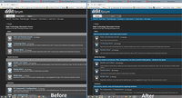
Hello. I'm developing a Greasemonkey user script for improving the not-so-good dark skin of digit forum (TDF). I've completed the script for the forum's home page and would love to hear your feedback (and other stuff) about it. I'm a little busy right now so the modification of other parts of forum will continue soon. Install the script and enjoy a better skin!
Note- I have tested the script ONLY on Mozilla Firefox. No guarantee for other browsers.
Steps to install-
1. Install Greasemonkey plugin for Firefox- *addons.mozilla.org/en-US/firefox/addon/greasemonkey/
2. Open the script's home page at TDF Improved Dark Skin
3. Click the 'Install' button, wait for a few seconds and click 'install' in the Greasemonkey installation dialog that appears.
4. That's it, you are done!
Leave your feedback, suggestions and requests (if any) here.
Note- due to a bug in Greasemonkey 2.0, automatic updating of scripts doesn't work and will be fixed in version 2.1. Any update to the script in the meantime will be posted here itself.
*i.imgur.com/a8w1dri.jpg*i.imgur.com/a8w1dri.jpg
- - - Updated - - -
Come on, did anyone use it?
- - - Updated - - -
Come on, did anyone use it?
Attachments
Last edited:

