The "glowing" address and the notifications are good ideas, but the notification is putting off the overall theme - probably because of its layout? Not sure where to put it exactly, but perhaps may be better placed?
Also, instead of "Shipping Address set to 3", will it be better to have "Shipping Address set to <City> - <Zip>"?
Finally, you really don't want
my suggestions on fonts, colors, lines, basically anything to do with "design", "aesthetics", "beauty" etc....you get the drift!

I could select colors and fonts on a website and make the predator in "Predator" appear handsome in contrast to my "design".

Perhaps, nbaztec could help.


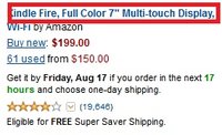
I checked Amazon and what fonts are these? Arial? They look ok to me.
Edit: Darn, the images don't show! How do you make attachments display as images! Or you cant?


